


It’s getting common these days to add side slide menus in website and we have received some comments a couple of times about how to add side slide menu in WordPress. Without a doubt, I hope that it will look really awesome if implemented correctly. However, in this article I’ll show you the simplest way to add side slide responsive (mobile-friendly) menu in WordPress.
There is a demo about side slide responsive menu that you should check.
Adding Side Slide Responsive Menu in WordPress
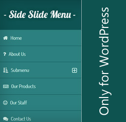
Side Slide Menu in WordPress
Side Slide menu is a lightweight responsiveWordPress side menu that expands and slides on click. It is built using modern web technologies like CSS3 transitions and JavaScript (without jQuery) on front-end which provides the high-performance results for both desktop and mobile devices. Side Side Responsive Menu comes with 3 shortcodes that let’s you hide/show/toggle menu from anywhere in your theme.
Features
- Customize any color
- Lightweight
- 350+ FontAwesome Icons
- 600+ Google Fonts
- Supports touch gestures on touch enabled devices
- 3 shortcodes that let you manually show/hide/toggle menu
- You can insert custom logo
- Place for additional information below menu
- Intuitive Admin Panel
That’s all about side slide responsive menu for WordPress users. However, to find out how to use it. Just go to Settings → Side Slide Menu.
0 comments:
Post a Comment